Filters
Drop Shadow Filter
Utilities for sets shadow filter to transparency image (SVG, PNG).
Variant
Active Checked Child-Selection Dark Mode Disabled Expand First-Last-Selection First-Letter Focus Focus-Visible Focus-Within Fullscreen Group-Focus Group-Hover Hover Landscape Light Mode Portrait Reduce-Motion Responsive Selection-Hover Visited
API
| class | css |
|---|---|
filter {drop-shadow} | filter: brightness(var(--brightness)) contrast(var(--contrast)) saturate(var(--saturate)) blur(var(--blur)) drop-shadow(var(--drop-shadow)); transition: filter var(--extra-smooth) linear, transform var(--extra-smooth) linear; |
| class | css |
|---|---|
| drop-shadow-xs | --drop-shadow: 0px 0px 1px rgba(0, 0, 0, 0.8) |
| drop-shadow-sm | --drop-shadow: 0px 1px 3px rgba(0, 0, 0, 0.5) |
| drop-shadow-md | --drop-shadow: 0px 4px 3px rgba(0, 0, 0, 0.5) |
| drop-shadow-lg | --drop-shadow: 0px 4px 6px rgba(0, 0, 0, 0.5) |
| drop-shadow-xl | --drop-shadow: 0px 4px 10px rgba(0, 0, 0, 0.5) |
Note: This utility does not support the inline property background-image:url() .
Usage
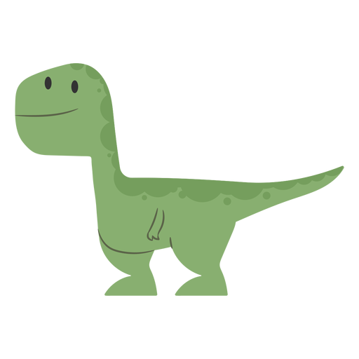
Filter: OFF
Filter: ON
Apply the filter class first, and then set the filter in any order when with other filters.
<img class="filter drop-shadow-md ..." src="...">
HTML
.dummy {
  @extend
    .filter,
    .drop-shadow-md;
}
SCSS
Mix with other filters, such as Brightness, Contrast, Saturate and Blur.
<img class="filter drop-shadow-md brightness-10 contrast-5 saturate-4 blur-5 ..." src="...">
HTML
.dummy {
  @extend
    .filter,
    .drop-shadow-md,
    .brightness-10,
    .contrast-5,
    .saturate-4,
    .blur-5;
}
SCSS